We just watched the Google event which saw the unveiling of a convertible tablet/keyboard, the Google Pixel C. With out background in covering all things Asus tablet (from the very beginning) we were compelled to point something out.
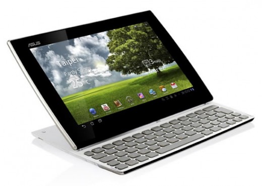
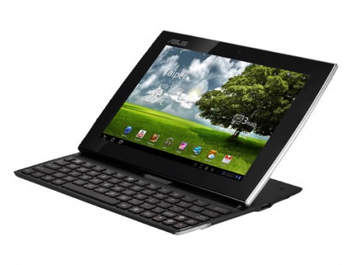
Asus has never really been cautious when it comes to innovation. Some hits and some misses but that’s how innovations can be made. It’s called taking risks. So when we saw the Google Pixel C we weren’t thinking about the Microsoft Surface, rather we needed to go back, way back in fact. We need to go back to that initial first wave of Asus tablets, the Eee Pad line-up. Within that line-up of Eee Pads, there was one model, the Eee Pad Slider SL101. If you don’t know about this tablet, we aren’t entirely surprised. Here is a quick reminder of what it looked like:
What we can tell you is that the Eee Pad Slider saw only one model. It was the one Eee Pad that didn’t have a follow up release. Say what you want, but the concept didn’t exactly catch fire. What didn’t help matters is that the Transformer tablet became the hero back then, putting the Slider on the back shelf. However, take notice of the design. Sure, the tablet wasn’t detachable like the Pixel C is or the Microsoft Surface is and the Slider didn’t have the option to adjust the angle of the tablet when propped up with the keyboard. However, check out the new Google concept, the Pixel C:
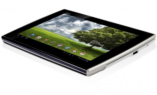
We aren’t going to sit here and suggest that the Pixel C is a clone of the original Eee Pad Slider, but we can say that they are both 10-inches. They both run Android. They both look very similar. Considering that the Eee Pad Slider came out in late 2011, we’re talking about almost four years ago. Check out below, showing that both components close together, so that the keyboard faces “up” and the tablet faces “up” creating a “hidden keyboard” effect.
What does this comparison really mean?
More than anything we thought this was an opportunity to showcase one of the early Asus innovations in the tablet space. We’re having a bit of fun with this article, so please don’t take this as being ultra serious in nature. There are plenty of similar designed combo’s or convertible out there is today’s market and by no means are we pointing fingers at this new Google product.
The reality is that convertibles and keyboard accessories are nothing new these days. The point isn’t so much that the Eee Pad Slider was ahead of its time, it’s just the fact that the new Google Pixel C reminds us so much of the Slider. Again, the technology has changed drastically and the mechanism on the Pixel C is far different than the somewhat clunky nature of the Slider.
But for its time, the Eee Pad Slider and it’s design was pure innovation and unique. It wasn’t however enough to make it a runaway success. The Pixel C tablet portion is completely detachable so that’s major design difference from the Slider.


